
Ahh! Lost Lagoon. It’s the most peaceful color I know. Not green, not blue – yet it pairs so well with each of those colors. Today we are working with Lost Lagoon, another favorite of the 2014-2016 In Colors.
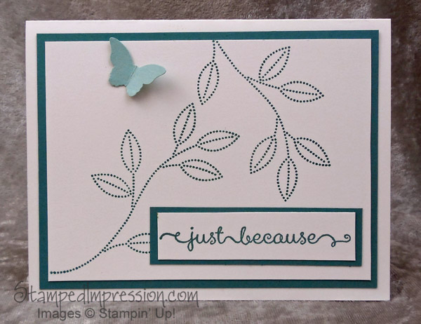 This card design has a lot of white space, allowing the simple lines to stand out. Very effective, don’t you think? Originally, I had stamped flowers on the stems. Then I tried punched flowers. But, at the end, I decided that less is more.
I had also planned to use only Lost Lagoon and Whisper White in this card design. But it was a little harsh. So the Bitty Butterfly punched from Pool Party card stock was the perfect addition. I considered using a pearl for the butterfly’s head, but (obviously) decided against it.
The stamped stems are from Grateful Bunch. This photopolymer stamp set can be purchased on its own in the Occasions catalog, or as part of a bundle with the Blossom Bunch Punch and save 15 percent. Everyone loves to save a little money! Plus, this is one bundle where I’ve used the products together, as well as on their own. It gives me more design options!
The sentiment is stamped from A Dozen Thoughts. I like to have a variety of sentiments to work with. The ones in this stamp set are a little different than the usual Happy Birthday and Thank You. It’s a great set to have, no matter how many sentiments you already own.
If you’ve been reading my blog for a while, you know that my favorite color is blue, while green is a close second. It’s no wonder that I absolutely love Lost Lagoon. I used it in so many projects. Here are some of them.
Click on any photo to read the original blog post about the card.
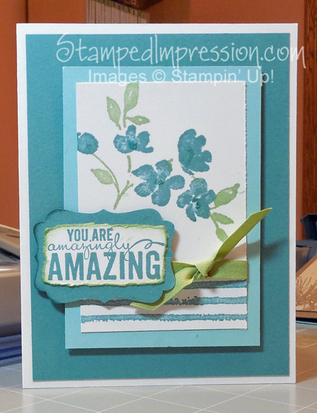
First, is my favorite card that I ever made using Lost Lagoon, when it was first introduced. I made it with Painted Petals, a stamp set I won at a Stampin’ Up! event. I sent a version of this card to my sister! By the way, hover over any photo of my cards and you can see the Pin It button. This card has over 450 pins!
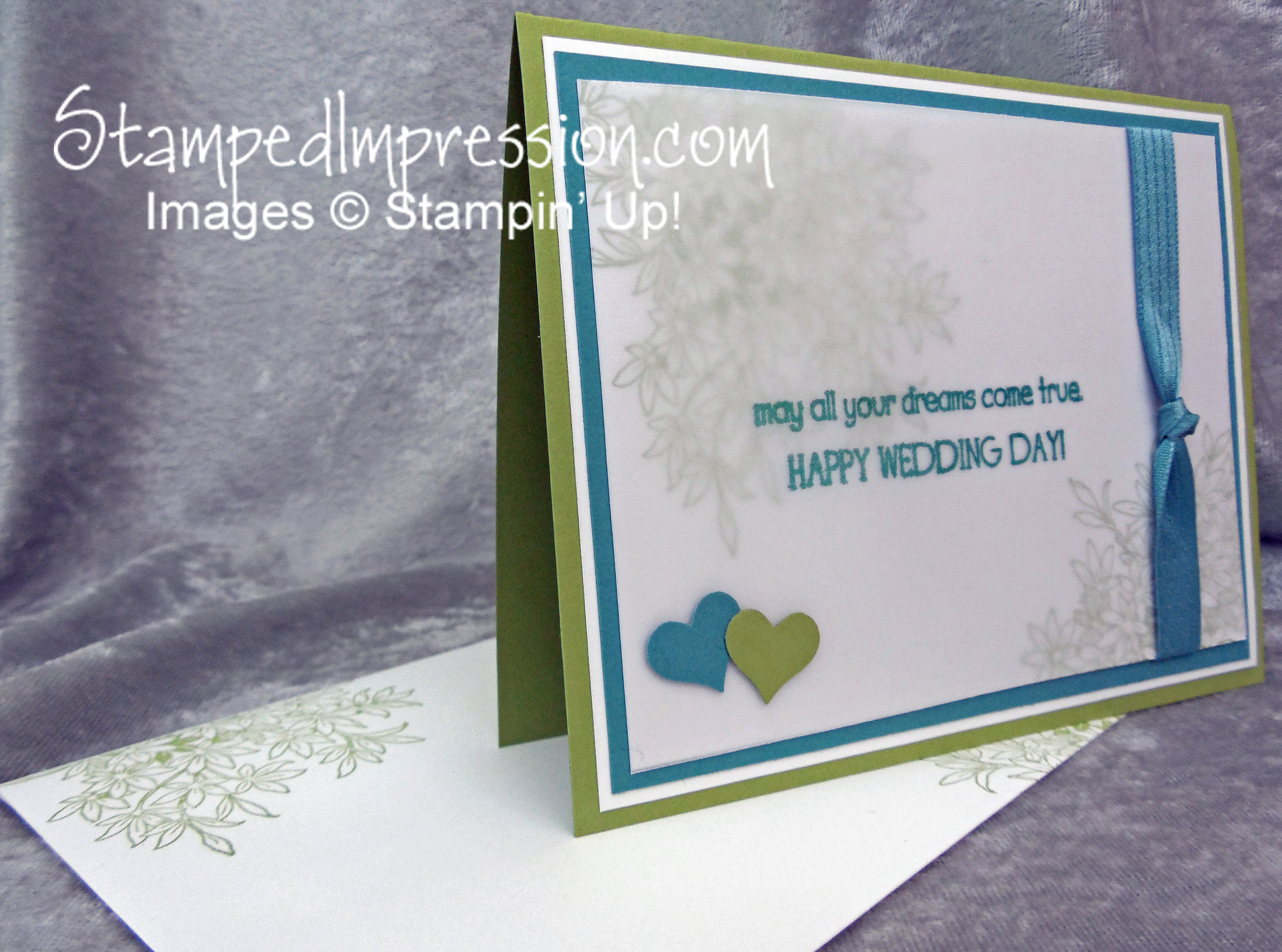
Here’s a wedding card I made. Once again I paired Lost Lagoon and green!
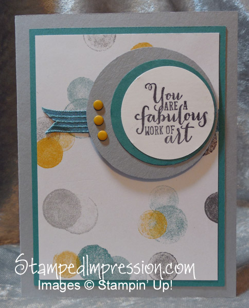
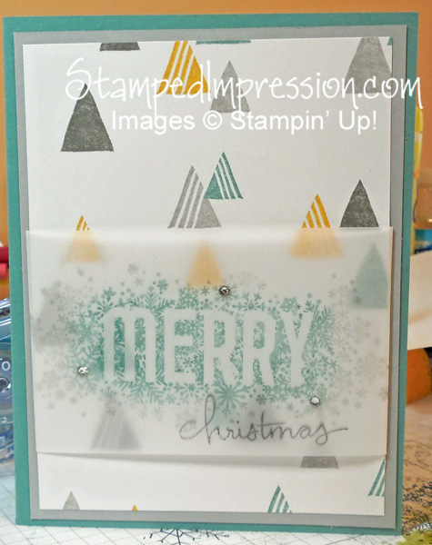
You are a fabulous work of art combines Lost Lagoon with soft Smoky Slate and rich Crushed Curry!
Using similar colors, I made a holiday card. Look, Mom, no red-and-green!
For me, Lost Lagoon is almost a neutral color, as it works well with so many others. So, be sure to have a little stash of it, before it retires!