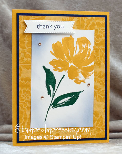
I love to use layers of paper in my card designs. I like to use embellishments. However, I’m not comfortable with the “over the top” designs using lots of each. Let me be clear. There’s nothing wrong with over the top cards. But I’m not good at them. I find that my designs look messy. I prefer clean lines. Like in this card. This super simple flower card uses several layers, embellishments and techniques. But it’s clean. And there is definitely a focal point.
I guess what I don’t like about my over the top designs, is that I bury my focal point. So, how did I keep it in the forefront of this card?
Focal Point of this Flower Card
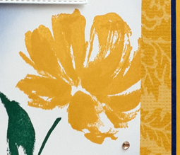
The focal point of this card is the stamped flower. Made with the Art Gallery stamp set, it’s super beautiful! But I think this card is beautiful in so many ways. So, how does the flower end up being the focal point?
- The flower is stamped on a layer of a contrasting color – Most of this card front is yellow. But the center layer, where the flower is stamped, is white. Clearly, this contrast helps draw your eye.
- The concentric layers of cardstock draw your eye to the center of the design – Yellow, navy, then yellow again, draw your eye in, so that it finally rests on the stamped flower. The navy matte is critical to this design element. Aaahhhh.
- Little spots of glitter surround the focal point – Those Champagne Rhinestone Basic Jewels are so pretty. And the little bit of bling surrounding the stamped flower, attracts your eye.
This card almost made it to my January online card class. The only reason I didn’t use it is that I try to limit the ink colors that I use in a card class. It makes it easier for the participants and keeps cost low. I couldn’t find a paper that I liked as much as the Designer Series Paper in this sample. So, the card made its way to my basket of Cards to Use Somewhere!
I nearly gave it away this week, because I needed a thank you card. But then I saw that I never shared it with you!
In summary

This is a classic design that you can use with so many different flower stamp sets and color combinations. Make some to keep in your stash. In fact, leave off the sentiment. Then add it only when you’re ready to send the card. Then share your design in the comments below. I’d love to see your super simple flower card!


I love the simple lines of this card! And…the flower just adds to it.
I don’t have much of an imagination when it comes to coming up with a design.
That is why I rely on you, Sandi, to help me!!
Thank you!
Thank you! I prefer the simple lines… It’s really difficult for me to think up complex designs LOL!
And I love that you come to me for designs. It’s my favorite part of being a demo. Plus, I do the research, so that you can save time!
Sandi