
I love to hand stamp cards. I want my cards to be memorable. I want my cards to look like I’ve put everything into them, but I simply don’t have the time to do that. Hmmm. Does any of this sound like you? It’s definitely me lol! Today’s card shows a tip to achieve that WOW factor, without taking a lot of time.
You know that saying about the shoemaker’s children going barefoot? Well, in the same way, the cardmaker is often late getting out her cards.
I had to send a thank you note and it was overdue. On top of that, the recipient is a card maker, too. And a very good one. No pressure. I had to come up with something special, or I’d feel inadequate.
Maybe that’s being melodramatic. But, truthfully, do you ever feel this way?
I’ve been noticing some cards lately that use die-cut shapes and almost no stamping. That’s what I tried to do. Here’s how I made it work!
The 4-1-1
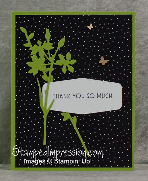
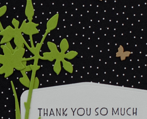
The die-cut shapes must stand out – My stem shapes are solid. Their color (Granny Apple Green) contrasts with the other colors on the card.
The lines on the card are simple – Even the font, on a large white piece, has an interesting edge to it, but all with clean lines.
I added an unexpected detail – The Brushed Brass Butterflies are beautiful. They have a very detailed edge. And they shine! You can’t do any better than that!
All that makes for a card with POP. What do you think?
Neutral Colors?
When I started this card, I had intended to make it monochromatic (that is, mainly one color). I also decided that it would be all neutral. I think my first version was completed in browns… from Crumb Cake, to Soft Suede, and all the way to Early Espresso.
But then I saw the black and white polka dot paper in the Pattern Party Designer Series Paper. And I stopped there! (This paper is a Host Reward that you can purchase at a discount with a $150 order or workshop.)
So, for a while, my card was all black and white. That’s often very dramatic. But today, it wasn’t working for me.
And then I thought, “It’s been a while since I used Granny Apple Green. I wonder how well that would work.”
The cardstock came out. And then the Tasteful Dies came out. I love-love-love the shapes of all those dies. I especially love that each one has gorgeous edging!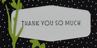
The hero of this card
- It’s not the sentiment – even though that is the focal point.
- It’s not the brass butterflies – even though the card is pretty dull without them.
- It’s the die-cut branches – they make the card design so unusual and interesting.
And yet, omitting any one of these would take the overall card design down several notches.
I guess the real success comes from adding one element at a time and evaluating where to go from there! 😉 Hey, that’s my tip of the day!!
But definitely, use an easy die-cut image for POP!
Try it and let me know how you make out!