Today, I’m continuing my work with the 2014-2016 In Colors, by working with Hello Honey. If you want to read my first post on the In Colors, then go here.
Hello Honey is a color I use often, even though it’s not my absolute favorite! Can you believe that? Why does that happen? I use Hello Honey often because it plays so well with others. I will use shades of yellow only occasionally as the design focus. I tend to pair yellows with another color to manage the design.
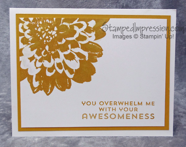
So, breaking the mold, here is a monochromatic card based on Hello Honey.
 This card design is so simple – 3 layers of card stock and 2 stamps! What doesn’t show in the photo is that I applied the Gold Wink of Stella Glitter Brush 141898 to the petals of the flower. Trust me. (Yikes! I don’t mean to sound like a politician! Sorry.) The gold glitter ink adds fun and richness to the card design.
Colors on this card are Hello Honey and Whisper White. Simple. Perfect. Hello Honey is dark enough that you can stamp the sentiment with it and still easily read the words. My eyes aren’t the greatest and I don’t like when the words are faint.
I stamped the sentiment from the Flower Patch stamp set. One of the things I like about this set is that you can buy it as a bundle with Framelits. I’m not one to “fussy cut” my images. But run it through the Big Shot or punch out with a hand-held punch and I’m happy!
The flower is stamped with Definitely Dahlia 138746. It’s a background stamp. Unlike other background stamps, I’ve never used is on more than half my card front. It’s never my entire background.
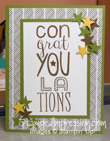
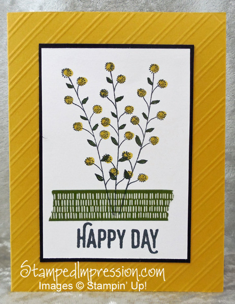
Interested in some other projects I designed with Hello Honey? Here are a few. Click on any photo to read about the card.
This design uses just a tiny bit of Hello Honey.
 Here is another design, where Hello Honey is a major color.
 Any way you look at it, Hello Honey is a great addition to your personal color collection!
Next week, I’ll continue looking at the 2014-2016 In Colors.
