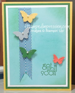
Today’s project is a perfect illustration of how a card design evolves. Take a look!
 This card started in a set of blues with snowflakes. I guess I’m just getting tired of the Midwest winter – LOL! Before I knew it, I swapped out the snowflakes for butterflies and added some spring-like colors. What do you think?
Here are some tips on how I achieved this design:
- To give the butterflies a sense of motion, I attached each to the card with a Stampin’ Dimensional. Although foam adhesive is usually applied to give the design depth, in this case it lifts the butterflies off the card, freeing them. We always imagine butterflies flying. This just supports what we see in our imaginations!
- To support the butterfly theme, I needed to move from winter to spring. This is easiest to do with color choice. I kept Pool Party and Whisper White, but added Daffodil Delight and Garden Green. (Hmmm. Do you think I like the brightness of these colors or their spring-like names?!)
- The Pool Party card front was boring. But I didn’t want to fill it with either a stamped design or an embossed design. So I sponged ink – Garden Green on the outer portions and Pool Party in the center. Sponging definitely softens the design, while filling in a blank space.
So, whether you’re in the mood for winter or spring, adopt this card layout. Then let you imagine soar. Experience for yourself how a card design evolves!
