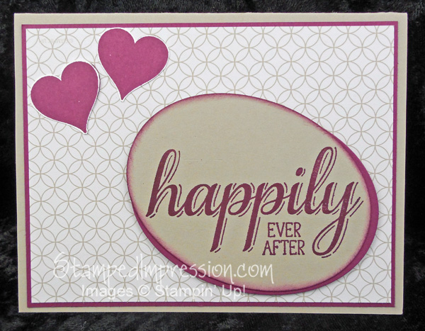
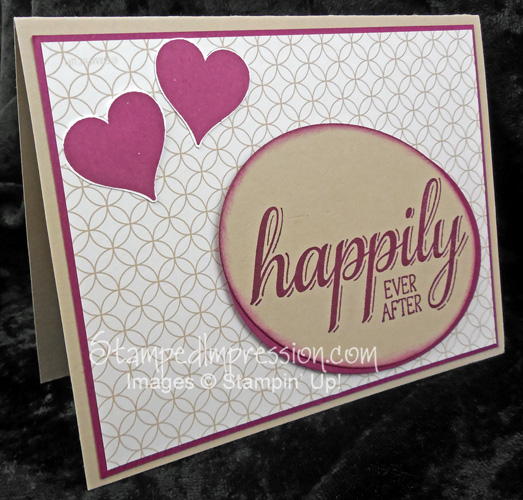
Today I’m showing you a way to design a cool card for the Bride & Groom. Wedding season is almost here, and I’ve been making a TON of cards. While it’s easier to create a bunch of cards that are identical, I like to work with a variety of designs. Here’s one for a down-to-earth couple!
 This card came together rather quickly, even though I faced a few issues. My goal was to make a clean and simple design. Here are some hints on what I did, and why.
The 4-1-1
- The background paper, from Moonlight Designer Series Paper Stack, has a subtle design. It adds dimension and texture, but the soft colors keep it from fighting with the other card elements for attention.
- Key elements are “askew”. Everything doesn’t need to be perfectly upright and perpendicular on your cards. I stamped the main sentiment and cropped it using the Oval Collection Framelits. However, I cut the oval at an angle. I place this on the card, so that the sentiment is perfectly horizontal. Makes it easy to read, don’t you think?
- It can be difficult to stamp on Designer Series Paper. When i tried to stamp the hearts directly on it, they turned out kind of faded. The lines on the paper seemed to resist the ink a bit. So, I stamped the hearts on Whisper White card stock, cur them out, and attached them to the card front. If you look closely, you can see this.
 Colors on this card are Sahara Sand and Rich Razzleberry. Not your typical wedding combination, but I think it fits this style.
Let me know what you think about this cool card design for the Bride & Groom.
