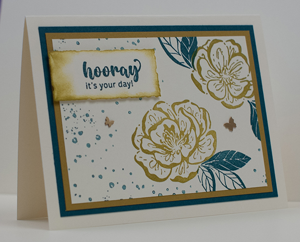
Today I’m working with fabulous new colors! With the new annual catalog, Stampin’ Up! introduced a color refresh. That means, they kept most of the existing colors, deleted some, brought back a few favorite ones from the past and added some brand new ones. This has caused me to have lots of fun playing with color. Look at this card.

This card is designed with Pretty Peacock and Wild Wheat.
Pretty Peacock was an In Color some time back and I loved working with it. I found I could mix it with so many colors.
Although it’s a returning color, it’s now part of a different palette. I still need to learn how it fits in.
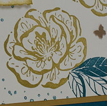
Wild Wheat is a new In Color. It’s so different from anything that I would normally choose for one of my cards. But look at it on this design.
In fact, I just used this color combination on a design that I’ve sold! I never would have expected that to happen to me!
What products did I use?
I was trying to keep things simple. Sometimes it’s fun to take a ton of products and use them on one project. But when I worked on this one, I didn’t want to do that. I really wanted to see how the colors played out. So, here is what I chose:
- Stamp set: Irresistible Blooms (Online Exclusive)
- Classic Stampin’ Ink: Pretty Peacock, Wild Wheat
- Cardstock: Very Vanilla Thick, Pretty Peacock, Wild Wheat, Very Vanilla
- Accessories: Brushed Brass Butterflies
- Tools: Deckled Rectangles, Sponge Daubers
So, what do you think? Was this a good color and product combination? I could have stayed with a bright yellow and a traditional green. But I didn’t feel that way at the time LOL!
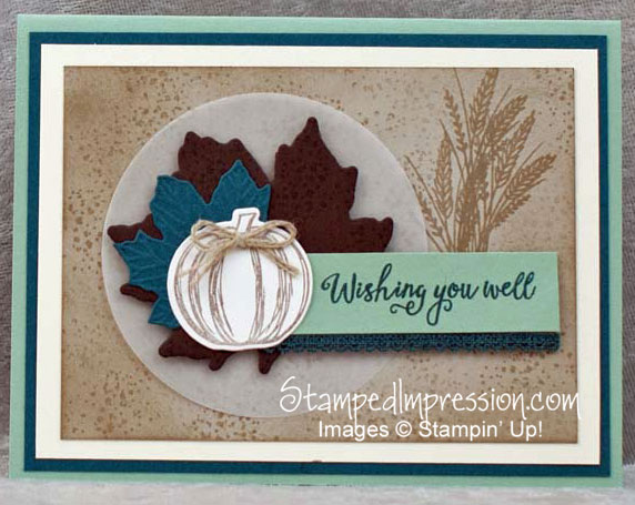
Curious about Pretty Peacock?
Check out an older project where I used Pretty Peacock. Click on the photo to see the original post.
How to work with fabulous new colors
So, if you’re looking for an easy way to explore the new colors, try following my example. Pick one. Then add just one other color and see what happens!
Then let me know how you made out!


