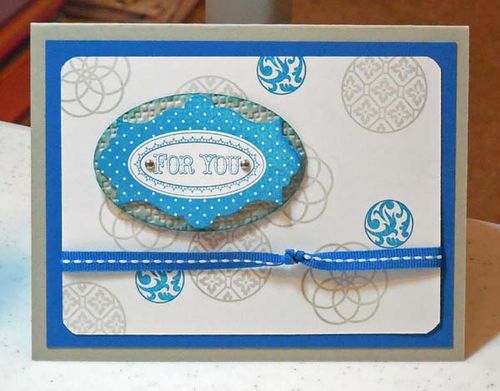
I've discussed many times how the creative journey takes us to unexpected places. Today's project is the result of one of the wildest journeys I've ever taken. This design really started as a card for a baby!
My first design was made with Pink Pirouette and Bashful Blue. Eventually, that evolved to this color palette: Sahara Sand and Pacific Point. (Don't ask me what happened to the colors in the photo. It's a dull day here and obviously it affected my camera work. Sorry.)
The baby card started with hearts. This card was made with Circle Circus, one of my Go-To stamp sets in the current catalog. The sentiment was stamped with Layered Labels, then punched out using the Big Shot and the Apothecary Accents Framelits.
I stamped fewer images on the Whisper White background than I typically do. I'm working on simpler designs these days!
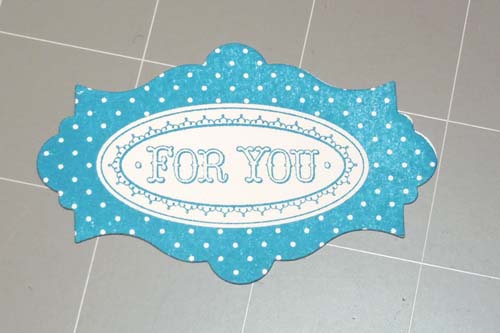
By the way, I have a tip for you. I stamped the sentiment first, then cut it out using the Big Shot. Nevertheless, the image was not positioned exactly where I wanted it. Look at the photo.
So, before attaching it to the card, I sponged the edges with Pacific Point ink. I exaggerated a little so that you can see the difference here. But, trust me; it's never noticeable on the real card!
By the way, if you'd like to see the original baby card design, visit my Facebook page and have a look. While you're there, please like my Facebook page. Thanks!


That’s right. Circle Circus is truly neutral. It is made appropriate for the specific occasion by the choice of color and embellishments!
Love that Circle Circus set! Good for any occasion!