Symmetrical and non-symmetrical card design. Do you have a preference?
In symmetrical design, each element is equally distant from the top & bottom borders, as well as from the left and right borders. Edges are parallel.
In non-symmetrical designs, each element is not equally distant from borders, nor are they parallel.
Which do I prefer? I’m a combo kind of person. I like a little of both. I illustrate this concept in today’s card.
Symmetrical & Non-Symmetrical
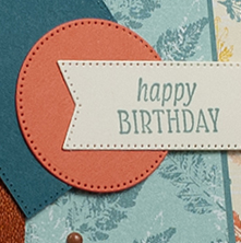
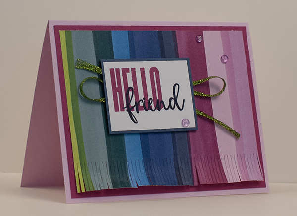
I find that symmetrical designs are strong and grounded. In the card above, The symmetrical layers are the “bottom” layers – the card base, plus the 5 layers of cardstock and Designer Series Paper on it. The way the edges of these layers move in to the center of the card front, draws your eye to the center of the card front.
Guess what? In the center of the card front, I placed the sentiment. Happy birthday is the focal point and the purpose of the card. So, it’s front and center. Then the non-symmetrical layers below it continue to draw your eyes to it – the ribbon, the square (sort of on point) and the circle. Together they outline a clockwise arc around and to the sentiment.
Did I put these together intentionally? Did I think, “How can I apply both symmetrical and non-symmetrical layers to achieve a beautiful card design?” Nope. But at the end, that’s what I achieved.
The key is to balance the use of each.
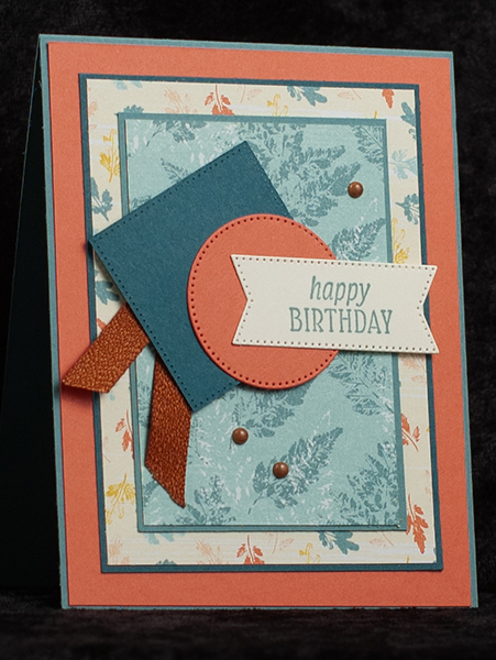
I’ve done that other times too. Here are 2 card designs. Click on the photos to see the original posts.
The Next Step
Are you having some trouble with card design? Caught in a slump? Try using the Symmetrical versus Non-Symmetrical card design approach I used today.
Also, visit my Facebook Business Page and see the designs there. Yuu might find a little inspiration there, too!
See if that helps, then let me know!