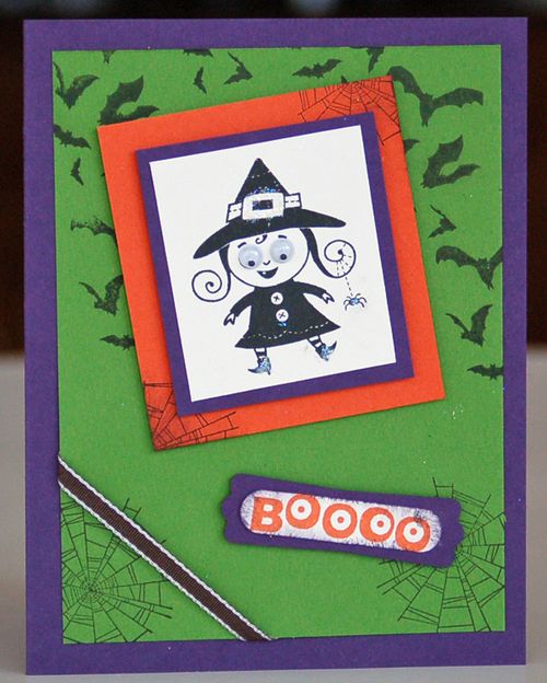
Who would expect a card designed with Googly Ghouls to be symmetrical? Probably my friend, Ed Mann! Take a look. As always, if you click on the photo, you can see a larger version of it!
Stamp sets used on this card are Googly Ghouls (from the Holiday mini) and Wicked Cool (from the Annual Catalog). I added a strand of Basic Black 1/8" Taffeta Ribbon at the lower left corner, just because I could! Sponging and attaching Stampin' Dimensionals behind the two focal images added dimension to this card design.
I purposely arranged all elements on the card front so that noting is symmetrical. But with the bats, spider webs and witch, does this make the card too scary?!?!
I think not. How could a witch with such a cute smile and lots of Dazzling Diamonds Stampin' Glitter be scary? And how about those eyes? What do you think? Leave a comment below and let me know.
But the Big Question is…. Should Googly Ghouls be symmetrical?


I think that I will send it to Ed. He can learn to adjust 😀 Good idea.
Gee, does EVERYONE think that it should be symmetrical?!?! I must really be working outside that old box 🙂
Maybe you should send this card to Ed! Just to prove that you don’t always have to be symmetrical!! 🙂
She reminds me of 2 little witches who went trick-or-treating so long ago in Oakville….
The witch is so cute! Despite it being asymmetrical ;]