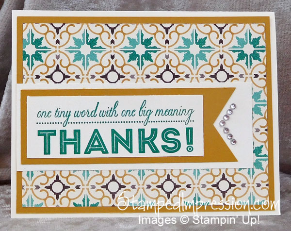
When I design a Thank You card, I like the words to be “front and center”. I like the font to be large and easy to read. That’s exactly what I have on this one big Thank You card design.
 I started this card design with the Moroccan Designer Series Paper. I love the lines and the colors. The color combination certainly makes me step outside my comfort zone. But, oh, what a result!
Please note that this Designer Series Paper is going to retire, as soon as supplies run out. Furthermore, it’s on sale for $7.70. Quite the bargain!!
The sentiment, from the One Big Meaning stamp set, was stamped in Emerald Envy. While I’ve always found this color to be fun and almost-flirty, it comes across as quite serious and meaningful on this card. Do you think it’s the paper design? Or maybe the words themselves?
I mounted the sentiment on a series of rectangles and a banner. You don’t always need to keep your lines parallel!
But the angles lines of Rhinestone Basic Jewels are critical to the lines. They run parallel to the end of the banner.
By the way, these rhinestones are also on the retiring list. However, Stampin’ Up! says they’re going to be “re-configured”. That means they will come in new packaging. Sometimes that means that the price is going up. Just sayin’…
Supplies used to create this card
This is a pretty short list, isn’t it? I believe the detailed design of the paper makes it unnecessary to add lots of “stuff” to your card design. As they say, Keep It Simple, Sister!
This is the perfect way to say one big Thank You!


