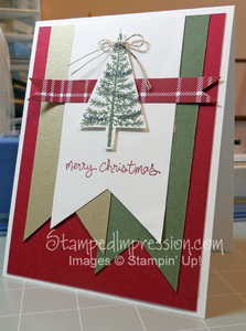
I’m not a real plaid person. I like stripes. I like lots of stripes. But place them perpendicular to each other and I’m not so comfortable. Today, however, I worked outside the box. I decided to add a little plaid to my card design, using Designer Series Paper. It made me smile!
 I like banners. That’s easy to see from this card design! I die cut 3 large banners using my Big Shot Die Cutting Machine and the Banners Framelits Dies. I stamped my tree (Garden Green) and the garland (Basic Gray) from the Festival of Trees stamp set. (By the way… I know that I only showed a few projects on this blog using this stamp set, but I’ve used it repeatedly in my monthly card class and in my finished products that I sell online.)
But I digress.
No matter what I did, the card was a little boring. So I added the small strip, with 2 banner edges, one at either end, using a sheet of the Trim the Tress Designer Series Paper Pack. Instant success!! It added balance and interest. I’m definitely pleased with this card design.
Here are some things to consider in the card design. They may help you design your own projects!
The 4-1-1
- None of my layers is glued down on all sides. The allows some gentle curls and spaces. My banners were also trimmed to 3 different lengths. Together, these two techniques add lots of dimension to my card.
- The large white banner in the center draws your eye in and allows it to rest on the focal point of the design, namely the tree.
- The skinny strip of Designer Series Paper is critical to the card design. It also helps draw your eye to the tree. Plus, there’s a lot going on in this design, due to all the layers of card stock. The patterned paper says, “Hey! Look at me. I’m very special!!”
Colors used are Cherry Cobbler, Always Artichoke and Brushed Gold. Gold is very festive and perfect for a holiday card!
So, even if you’re not a plaid person, give it a try. Add a little plaid… with Designer Series Paper!
