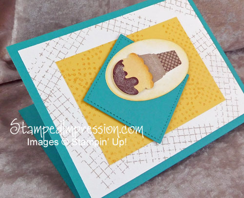
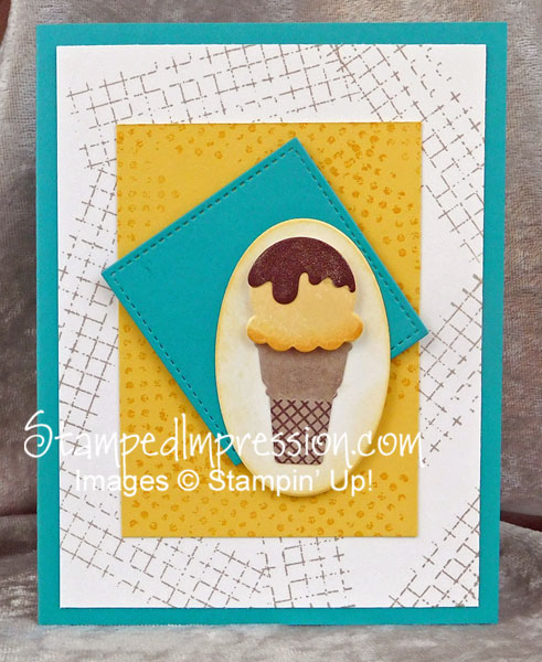
#imbringingbirthdaysback with Cool Treats! Need I say anything more?
Do you remember the campaign to bring back birthdays? It started about a year ago. It’s designed for people who want to send (and receive) cards in the mail. Don’t get me wrong. It’s nice to be remembered, in any happy way. But it’s not nearly as much fun to read birthday wishes on social media, as it is to find a card in your mailbox!
I posted some simple card designs for the campaign last year. You can see one of those posts here. But a birthday card designed for #imbringingbirthdaysback is long overdue. So, here we are!,
My monthly birthday campaign usually featured 2 cards with the same base design. One was feminine, while the other was masculine. This month I decided to create only one design that is suited to both genders. After all, cards for women don’t have to be pink and red, with flowers and butterflies. Cards for men don’t have to be blue and brown, with cars or abstract images. Hmmm. What do men and women like equally well? Ice cream, of course!
While this card has a lot of pieces, they are all cut out using the Big Shot die-cutting machine. It really made this card easy (and fast!) to assemble.
The 4-1-1
- Your design doesn’t need to be symmetrical – I have a friend who really likes everything to be symmetrical. It all must be straight up-and-down, and centered. Symmetry makes me comfortable, too. But it’s nice to mix it up a little. I started by placing my little ice cream cone to one side. And then I needed to turn the Bermuda Bay square. I admit that it looked a little “odd” to me when I was finished. But now that I’ve stared at it for a couple of days, I really like it. I think I need to shake up my designs a bit more often!
- Use an assortment of shapes – This card started with one rectangle matted beneath another. I had lots of layers. All similar. But adding the oval and the square and the ice cream shapes made it so much more interesting. Keeping wide “margins” prevents the shapes from being too busy and interfering with each other.
- Pop-up the main element – A tried-and-true technique is to use Stampin’ Dimensionals under your main element to make it stand out. By die-cutting the ice cream cone – and adding Wink of Stella to it – it is clearly the most important part of the card front.
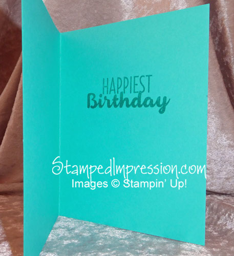
 How do You Know it’s a Birthday Card?
It says so on the inside!
If you don’t have enough room on the card front for everything, keep something for the inside – In this case, I couldn’t fit in the sentiment. So, I stamped the words on the inside! Easy solution 🙂
Here are the supplies I used
Big Shot – Important Tool
Do you have a Big Shot? I use mine nearly every day. I can’t imagine card making with out it.
Do you own a Big Shot? Do you use yours often? If not, do you know why? Head on over to my Facebook business page and learn my #1 Big Shot Tip!
Be sure to like it and share it with your friends!
Then think about #imbringingbirthdaysback with Cool Treats!


