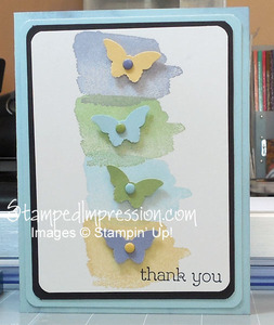
I’m all about clean lines on my projects. Today’s project uses a simple card design that POPS! If I made cards only for myself, I’d be a minimalist. I’m not really into a lot of fuss. At least, not most days. However, part of the challenge – and fun – of being a Stampin’ Up! demonstrator, is designing all kinds of cards that appeal to many people.
Getting back to today’s card…
 Originally, this was just a 2-layer card – the Soft Sky base and the Whisper White layer on top. I stamped the soft smudges using the Happy Watercolor stamp set from the Occasions Catalog. I chose Wisteria Wonder, Pear Pizzazz, Soft Sky, and So Saffron. I added butterflies punched in the same colors with the Bitty Butterfly Punch. Some Candy Dots, Stampin’ Dimensionals, and a sentiment – that’s all it needed.
However, I continued.
I added a second layer of Soft Sky. I also added a layer of Basic Black. Now the smudges and butterflies are complete. Don’t you agree?
Top Tips for this Card:
- Black is often an excellent choice to make a design element POP. It worked especially well here, as the rest of the colors were soft. However, use it in small quantities.
- Repeat colors to make the card design cohesive. Here the colors of the smudges were repeated in the butterflies and Candy Dots.
- Sponging the card base in the same color helps the next layer of the same color stand out a little. Between the sponging and the Stampin’ Dimensionals, there is a stronger shadow between the two Soft Sky layers.
Even though this card has 4 layers of card stock before adding embellishments, it’s still a simple card design that POPS!

Great color combination — very soft — but yes, that little pop of black is magic!
Just remember to keep the black to a minimum. Otherwise, it’s not pop. It becomes a blanket. Still nice, but a totally different effect.