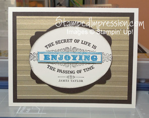
When I make a card for someone, I put a lot of effort into a design that they will like. Obviously. However, when the recipient’s likes and dislikes are specific, it can challenge me. That was my challenge last week. I wanted to make a card for a friend who is extremely partial to symmetrical design.
 I started this design with the colors – Early Espresso, Brushed Gold, Very Vanilla, and a little pop of Pacific Point. Masculine combination. Then I added the sentiment From My Heart.
I made good use of my Big Shot, too, I cut shapes using the Ovals Collection Framelits Dies and the Deco Label Framelits Dies. I ran the gold metallic card stock through the machine with the Stripes Textured Impressions Embossing Folder.
Clean lines. The message is front and center. Overall, a pleasing, masculine, balanced design! And ever so easy to make yourself! This is how you design an interesting symmetrical design!
