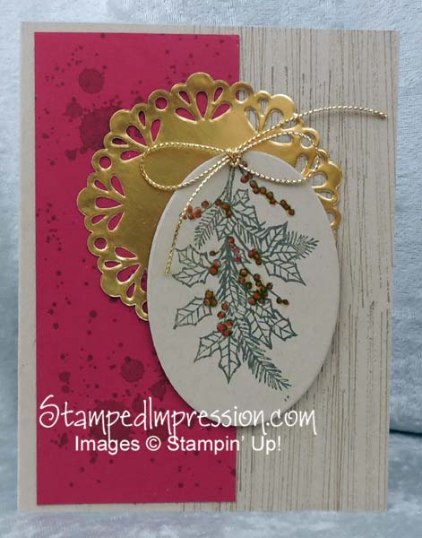
Greenery and gold – the perfect combination during this holiday season! Take a look at this holiday card design.
 There are so many relevant points to share about this card. Here are the most important:
The 4-1-1
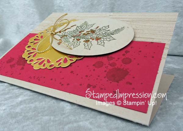
- Combine textures – First, there’s the shine of the Gold Foil Doily. Then – although it’s difficult to see in the photo – there’s the shimmer of the red berries. They were stamped, then covered, with Crystal Effects. Finally, there’s the Gold Cording Trim.
- Stamp background in the same color as the card stock – The wood grain and spots were stamped on Crumb Cake and Cherry Cobbler card stock in ink of the same color. This is yet another way to add texture and interest. It’s my favorite way to add background “color”.
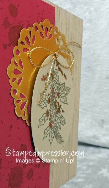
- Pop it up – Even when you mix textures – especially when you mix textures – you need space between the textures. it allows each to earn its focus. Popping up the center panel with Stampin’ Dimensionals calls attention to it. Even though it’s the same color as the background, it is the focal point. Hmmm.
Here’s a tip to save a little money: When you tie ribbon (or cording trim) on a card, work from the spool. After you tie the bow, then cut it off. You’ll waste far less ribbon. Try it!
 And finally, I have a note to make about the Gold Foil Doily. With all the hype of the holidays and the Holiday catalog. With all the excitement about the Occasions catalog and Sale-A-Bration coming next month. Many people are overlooking the Annual Catalog. These Gold Metal Foil Doilies are in the Annual Catalog. They are perfect for Christmas. They are the best for ANY celebration. Take a peek at the Annual Catalog.
Even better, I received them as a reward from my upline, Janice Weightman. Is it an expensive reward? No, of course not. But it was so much fun to receive! It’s part of being in the Stampin’ Up! demo family! Thank you, Janice!!
 One last note before I leave today… do you follow me on Facebook? You should. today I show the cutest little penguin. If you have a minute, head on over there!
