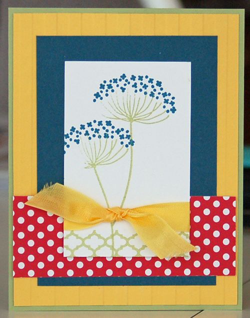
An easy way to think outside the box is to work with unexpected colors. And that's exactly what I did today, in designing these Cool, Bright Summer Silhouettes.
When I first saw the Summer Silhouettes stamp set in the Annual Catalog, all I could imagine was using soft and/or neutral colors. But today is a different story. After all, if I never ventured outside my comfort zone, you would tire of visiting my blog. I think the fact that I'm willing to take a chance to try something new, is part of what makes many of you check in on me from time to time!
Today's colors are Daffodil Delight, Real Red, Not Quite Navy, Certainly Celery and Whisper White. Okay, only the first two colors form this set are bright. But they make up most of the card front. And they certainly draw your eye into the design, framing the main stamped image. In fact, I believe the subtle colors make it possible for your eyes to travel all over this card, without tiring.
So, what about you? Do tend to design in one type of color? Do you dare to ever design outside your comfort zone? If so, what compels you to do that? Leave me a comment and let us all know!
And enjoy the Cool, Bright Summer Silhouettes!


Kathryn, I would NEVER immortalize a weed on one of my card 🙂
Deanna, thanks for the kudos. It’s tough to try new things!
I would have done the same thing — neutrals! Thanks for nudging me out of my comfort zone! Plus, with this lively color scheme, I’m thinking less about Queen Anne’s lace (a weed!!) and more about a lovely, wispy blue flower!
the polka dot paper is really cute! and i always love that embossing folder =] cute card and kudos using bright colors!