What do you do when you end up with a busy card design? Especially one that is TOO busy. That’s the topic of today’s Sunday Save.
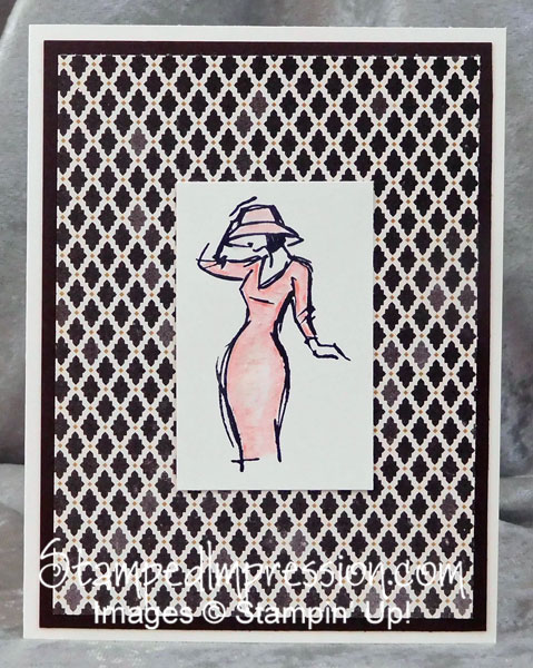
Here is my first draft of my card.
 It’s okay. But I wasn’t really happy.
What I did wrong
The design really isn’t too bad. However, I cut the Very Vanilla card stock quite small, leaving little “white space” around the stamped and watercolored image. As a result, the woman is buried in the very busy pattern of the Designer Series Paper.
I could have stamped the woman again on a larger piece of card stock. That would have solved the problem. However, I didn’t want to watercolor the dress and hat again. (By the way, this is SO easy to do. It really would not have been a hardship to repeat the effort.)
In any case, I found an even easier and faster solution to my problem. Can you figure it out? Here’s the answer…
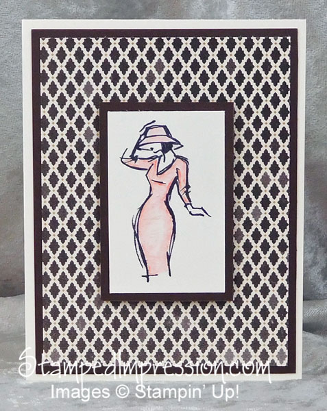
Add a Mat
I added a mat under the stamped card stock. Matching the card stock to one of the major colors in the paper, created a kind of white space. It gives your eye a wider spot in which to rest. Can you feel the difference?
 The repetition of color keeps the monochromatic feel of the design. Easy peasy, as they say!
Some Additional Tips
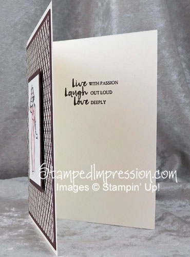
Because the card front is so busy, I didn’t want to add a sentiment to it. I felt the lines would be too busy. So, I stamped the sentiment on the inside.
As an aside… This is one of my most favorite sentiments of all time! <3
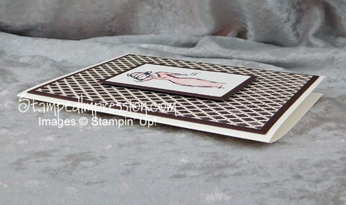
 Finally, in a desire to keep the design from appearing “flat”, I popped up the central image. Stampin’ Dimensionals, the foam-backed adhesive pieces, raise the card stock. The shadow that they create make the mat appear even more important!
The Lesson Learned
So what do you think? The next time you find that your card design is too busy, try adding a mat that blends in with a main color. See if that helps!
What Would You Like to See in this Column?
Do you have a particular problem or issue with your card making/design? I’d be happy to address it in a future blog post. Just send me an email and I’ll cover it!
Check out your cards. If you have a card with a busy design, try adding a mat!

