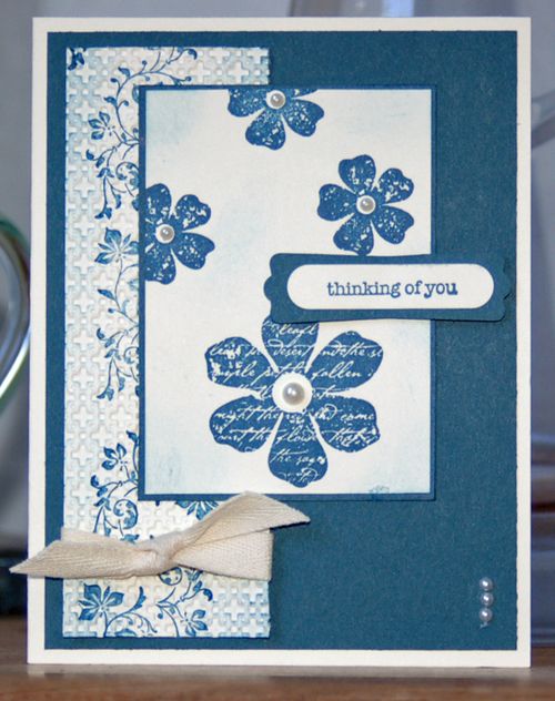
Blue Vintage … that describes my mood today. I love blue – Not Quite Navy is exceptionally soothing – and I've become fond of vintage styles.
This card, with images from the Vintage Vogue stamp set, has only 2 colors: Not Quite Navy and Very Vanilla. I considered adding another color, but then the mood shifted. Remember, colors have an impact on mood.
The vanilla card stock on the left was run through the Big Shot with the Square Lattice Textured Impressions Embossing Folder. Then I sponged a little, for more depth. I also sponged on the featured card stock in the center. Some Twill Tape and Basic Pearls … this card is done.
What kind of crafting mood are you in today? Leave a comment and let us know. Perhaps you're also feeling a little Blue Vintage!


I think we used to stamp lots of dots or other random patterns, to give the impression of texture!
Another gorgeous one- I don’t seem to stamp and then texture it. What did we do before texture?
Me, too. I wonder if it will be in the new catty?!
I love this set!! Every time I see it I remind myself to go quick and make a card! So elegant!