
Black and white and shiny gold. A classic color combination! Here’s today’s card design.
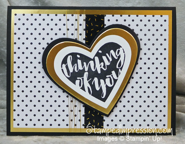 The sentiment, stamped in a whimsical font, is from Pop of Paradise . I almost missed this stamp set in the new catalog. When looking through it, I saw the flamingo. This is an image that doesn’t interest me so much, so I kept going. But I love this stamped sentiment! And to think that I nearly passed over it.
Once stamped, I cut out multiple hearts from the Layering Circles Framelits and my Big Shot. Specifically, I used a Gold Foil Sheet and Basic Black card stock. Those same papers make up the card base. On the card front I also added a layer of Pop of Pink Specialty Designer Series Paper.
I also added a strip of Pop of Pink Designer Washi Tape and some Gold Metallic Thread.
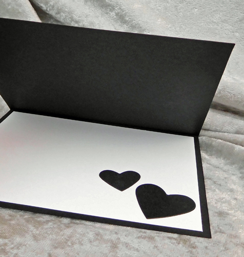
Since I made a black card base, I needed to attach some card stock to the inside, giving the sender a place to write. Therefore, I added a layer of Whisper White card stock. To add some cohesion to the card design, I added some small hearts cut from the same set of Framelits. Take a look.
 Here is what I find interesting about this card design. Often, the color combination of black, white and gold has a formal look. But the design of the Washi Tape and the non-parallel strands of metallic thread make this an informal design. Of course, the font supports that, too!
So, what do you think? Compare this design to that on my Facebook business page. Although both designs are similar, each is made with a different set of colors. Which card to you prefer? Leave a comment and tell us why!
Black and white and shiny gold. A classic color combination!