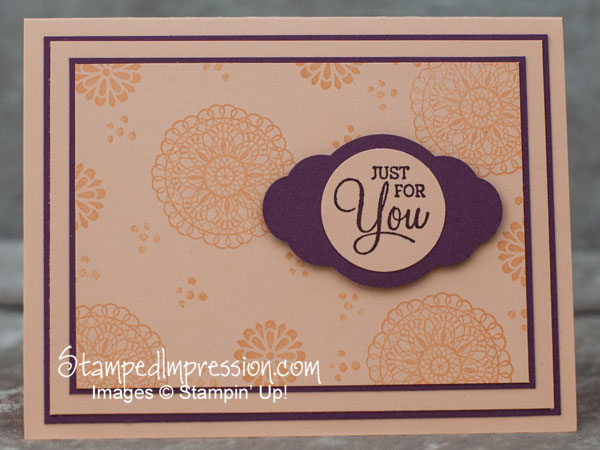
Today’s post shows how I take a card design and step it up – just for you! Specifically, I added layers, lots of them. It’s simply one of my favorite ways to enhance a card design.

The Simpler Version
Many of us are into simple card design. Using only 1 or 2 layers makes for a simple card. If you check out my facebook page, you’ll see how this card design evolved.
This card has 9 layers: 7 cardstock layers and 2 ink layers of ink. (Ink is on the background of the card front and the sentiment on the punched circle.) When I first started making hand stamped cards, I was told that the minimum number of layers should always be 6. Who knows where that number came from? But it always stuck in my head LOL!!
Anyway, if you check out my Facebook business page, you’ll see the simpler version of this design. While you’re there, please LIKE my Facebook business page. I promise that I’ll be updating my status on it more often!
The 4-1-1
- 2 contrasting colors – To keep things simple and clean-looking, I stuck to only 2 colors: Petal Pink and Fresh Fig. However, any 2 contrasting colors would work as well. So, pick 2 that you like!
- Don’t crowd the images – Often when stamping images on the background of the card front, I see people really fill the space. It’s not necessary. Allow some breathing room between stamped images. It will give your eyes a place to rest for an instant. They’ll thank you for it!
- Use Stampin’ Dimensionals for accent – another product that’s often overworked are Stampin’ Dimensionals. They’re really inexpensive (less than a penny apiece). But when you use them between too many layers, they can make your card bulky. In this design, I used 2 Stampin’ Dimensionals only under the matted sentiment.
Products I Used to Create this Card
Stamp
Ink
Card Stock
Tools & Adhesive
Punch
Accessory
Other Examples of a Step-It-Up Layered Card
Want to see other examples of card designs that use lots of layers of cardstock. Check it out here.
Call to Action
Visit my Facebook business page and check out a couple of simpler versions of this card. Be sure to b my page. Then leave a comment to say which design you like the best!
Happy Friday! Use lots of layers!

