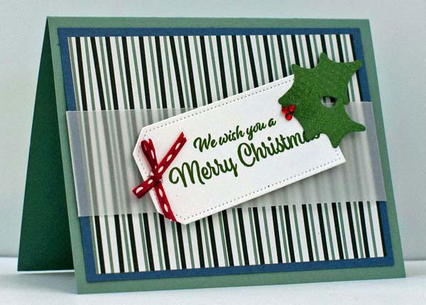
A simple design that POPS! That’s what I call perfection in a card design!
I like a card that has clean lines. Simple elements. Colors that support each other. A card where each element brings something special to the overall card design. And all of it together, makes you say WOW. To me, that the POP.

Today’s project does all of that. It’s one of my favorite holiday cards this season. The main element comes from a card that I “swapped” with another demonstrator, Cindy. Her card was beautiful, but it wasn’t me. This card is me.
The 4-1-1
- Colors make the POP – I used Misty Moonlight and Soft Succulent for the card base. Both colors are of the same intensity. Then I added Real Red trim and rhinestones, which contrast with the greens and blues. There’s the POP. And, just in case they could be lost in the rest of the card, I attached them on a Basic White space. That absolutely allowed them to make a statement of their own!
- Designer Series Paper adds design and color, and easily – The paper added more shades of blue, with the green and white. The striped pattern eliminates the need for stamping on that layer. Thus it’s an easy addition to the card design!
- White space helps focus your eye on the focal point of the design – The sentiment, the die-cut leaves, the rhinestone berries, and the red bow all make up the focal point of the card. They sit on a white tag, which makes them easier to see. And to ensure that the white tag stands out, it sits on a white vellum strip. The vellum softens the pattern of the paper below it. Isn’t that cool?
Make it Easier
To make it easier to fit the vellum on the card, I cut it about 1 inch longer than the card is wide. So, 6-1/2″. After gluing the Designer Series Paper to the Misty Moonlight cardstock, I lay the vellum across it, centering it. I folded the vellum over cardstock, and secured it on the back with regular tape. I didn’t need a ruler to measure it and it fits perfectly. Simple!
I love to die-cut shapes. But, when creating multiple copies of a card, lots of die-cutting slows me down. It’s much faster to use a Paper Trimmer and cut straight lines. So, if you prefer and want to simplify more, stamp the sentiment on a rectangle of Basic White cardstock. Instead of leaves, cut a triangle of green cardstock. (It can have 3 unequal sides.) The die-cut shapes are definitely more interesting. But the rectangle and triangle are faster to assemble. It depends on the time you have available.
Keep it Simple
Part of what makes this design clean and simple, is that I don’t layer a patterned piece on another patterned piece. Most of my layers are solid, without a pattern.
That’s definitely part of my style!
Conclusion
So, this card is simple in design (and construction). But the color choice and the layout make it POP. I call that Perfection!
What do you think? What do you look for in a perfectly designed card? Please leave a comment and let us know!

