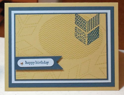
It's almost become an obsession. I just have to use my retiring colors before they're gone. Today's project is a masculine card in the retiring colors. What do you think?
Today's design process started with the colors, namely River Rock, Not Quite Navy and Bashful Blue. Oh, how I'll miss those shades of blue. Although, we still have some nice ones left, and once they introduce the In Colors 2013-2015 maybe we'll have yet another one!
Simple design. Lots of layers – both in card stock and in stamping. I pulled everything together by repeating the banner shape and the ovals. Tip: Repeating shapes is an excellent way to tie together your card design.
Do you want to be sure to have these colors in your own collection? Well, don't forget that if you shop today, you'll also enjoy free shipping. Don't wait until the last minute. I heard that Stampin' Up! is already out of the Certainly Celery Ink Refill.
I already shopped, so I'm in good shape. So, for now, I'll make a few more masculine cards in retiring colors!


That’s right. Think about it like fashion. We don’t wear the same colors and styles year after year. And we wouldn’t shop in a store that never changed their inventory. Why would we want our stamping supplies to remain unchanged?
Great color combination! What a shame they are going away. Oh well, nothing lasts forever and now we can get excited about what’s coming next!