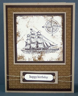
I'm so traditional in everything that I do. I've always been this way. So, when I stamp boats and water, I naturally pull out the blue card stock and ink. But not today. This card was inspired by a swap that I participated in.
First of all, everything is brown! Not a speck of blue! So, instead of highlighting the water, this card highlights the vintage look! My point is that color is a critical component of every card design.
Stamp sets are The Open Sea (which retires on August 31 with the current summer mini) and Teeny Tiny Wishes. Layers of Crumb Cake, Chocolate Chip and Very Vanilla make up my non-traditional color choices. As for the ink on the center square … I hate to admit it, but that was an experiment. I applied ink to an empty acrylic block, and from there to the card stock. It wasn't the look I was after, but I like it. I think it's cool!
I used Linen Thread, Neutral Brads and Stampin' Dimensionals with the sentiment, to add depth. Here's is a closer view.
Do you ever step outside your comfort level, when it comes to color? Leave a comment below and let me know!
Until next time,
Happy Stamping!
Sandi


I know that you’ll show it to me :=]
I’m thinking the same thing! I will definitely be borrowing this one to try with my different sailboat stamp. I’ll have to think about whether I’ll show it to you or not! lol
Thought you would like the vintage style 😉
I know you have a sailboat stamp. You should try this design with your stamp set! I’d love to see the design you create!
Love, love, love this one!! I think you can do just about anything under the umbrella of “vintage”. It is surprisingly freeing! I’m trying to really hard to get out of my color and style comfort zone, but gee it’s hard to do! Monochromatic and earth tones are where I tend to hang around, so this card really makes me smile!!