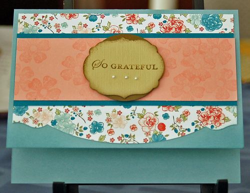
You can still mix and match products and styles. When Stampin' Up! introduced product suites a few years ago, many of us started to complete projects using only products from one suite. It was easy and the products coordinated so well. But if you work only with products from one suite, all your projects start to look alike. To show how you can mix and match, I came up with this card.
The stamped sentiment is from the Apothecary Art stamp set, part of the Attic Boutique product suite. The Twitterpated Designer Series Paper is from the Twitterpated product suite. (By the way, both product suites are available in the current Occasions Mini catalog.) The flowers stamped on the Blushing Bridge card stock are from the Vintage Vogue stamp set, which has been around a while. Hmmm. These products all work together well, don't they?
The only other surprise is that the center sentiment uses totally different colors from the rest of the card. I started using colors found on the paper, but then decided to take a leap of faith. Not my typical action. But it felt right here!
So, the next time you're looking to do something different, why don't you mix and match products that you consider to be different. You may be pleasantly surprised!
Until next time,
Sandi


Thanks. I wasn’t so sure about that Edgelit. I don’t always like to invest the time in learning new skills, but this one was so worth it!
“Twitterpated”! What a great word! From Disney’s “The Sword in the Stone”, if I remember properly. The owl (Archimedes?) uses it.
The Adorning Accents Edgelits Die does something so special to the edge of the card. Love it!