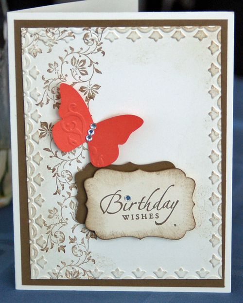
How to Achieve a Vintage Look. The easiest way is with color. Today I'm working with Very Vanilla and Soft Suede.
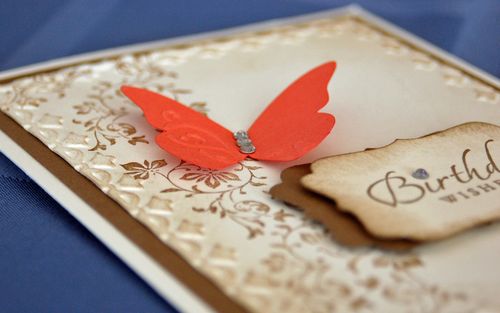
The interesting thing about this card, is that I'm not using too many of the traditional vintage-type products. The stamp sets are Vintage Vogue (okay, that's definitely "vintage") and Sincere Salutations. The butterfly, made with my Big Shot and the Beautiful Wings Enbosslits Die, looks kind of vintage. But I punched it from Calypso Coral card stock. I find that to be a very bright color … and definitely not vintage. Do you think the Basic Rhinestones tone down the color? And, of course, sponging often seems to be a little "time stained".
I also used the Framed Tulips Textured Impressions Embossing Folders. That is definitely a youthful design. However, the sponging, again, ages the frame a little.
By the way, this card has lots of dimension. Take a closer look. It's definitely interesting on all sorts of levels. I can't decide which is my favorite part. Maybe the tulip frame…
So, if you're trying to come up with a vintage card, but don't have quite the right stamp set, try using this color combination. Just remember to keep the Calypso Coral to a minimum – let it add "pop", without taking over! In no time at all you'll see how to achieve a vintage look!


