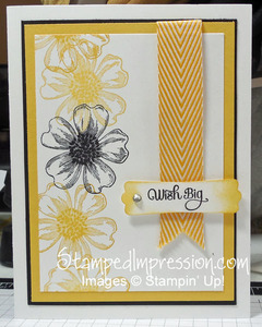
I love yellow, black and white. It’s such a bright, happy color combination. Here’s a card I made a couple of weeks ago, while working on projects for March Card Class.
 This is my favorite image from the Flower Shop stamp set. I stamped it in Daffodil Delight, Summer Starfruit and Basic Black. Yes, there is really more that one shade of yellow on this card!
Don’t you love the sentiment? It’s from A Dozen Thoughts, a stamp set introduced in our annual catalog. The curliness of the text is just so fun!
I won’t use it for card class. Using the same stamp in multiple colors slows down the process. That adds stress and NO ONE like stress at card class. so, I designed something else. Card Class is all about having fun, making cards and no stress!
Here are my Top Tips for this card:
- Don’t limit yourself to one shade of a color. Besides using ink that is Daffodil Delight and Summer Starfruit, I chose the Crushed Curry 3/4″ Chevron Ribbon. It actually makes the design more interesting.
- It’s okay to stamp images so that they overlap. On this card, the flowers overlap. It doesn’t hurt the final product, by seeing stamped flowers “through” other stamped flowers. Most of you probably didn’t even notice it until I brought it up!
- When using Rhinestone Basic Jewels, be sure to press the rhinestone well onto the card stock. Obviously, I didn’t do that on this card, and I didn’t notice until I started to write this post. Somewhere on my craft room floor is a Rhinestone Basic Jewel :\
So, the big Lesson here is to enjoy the creative process. I love yellow, black and white!
