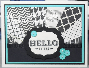
I like to work on monochromatic designs. I find their simplicity very calming. However, you can add a splash of color for interest on these card designs. Here’s an example.
 I selected the Peachy Keen stamp set from the Occasions catalog. This particular sentiment made me think of Very Vanilla and Basic Black. I used only those two colors of card stock, as well as bits of paper from the Modern Medley Designer Series Paper.
This card looked good. Perfect for a man. But, I wanted to soften the design. I was going to add Real Red – that’s the color I typically add to a black-and-white design. But then the Coastal Cabana card stock called out to me! So, that’s what I used.
Tips:
- Adding the small punched flowers changed this definitely male design into a card fit for a woman!
- Inking the edges of each flower and adding a tiny Pearl Basic Jewel to the centers gave the flowers some depth.
- Achieve balance in the “sunburst” design, by alternating paper that is mostly black with paper that is mostly vanilla.
That’s it. Pretty quick and easy! And I believe that adding the splash of color made the design more interesting. What do you think? Leave a comment and let me know!

Was it hard to get the angles right on the black and white strips? How did you do that?
Actually, it was really easy to do. Basically, I started with rectangles of paper. Then I cut each from corner to corner, making triangles. I just glued these on a base and tripped the excess away. Hmm. Maybe I’ll make another card like it and create a tutorial to show it better. Thanks for the idea!!
Love the colors. And so happy you are posting cards again!
Thanks! I’ve been designing and making cards all along. It feels great to be sharing them again!