Recently, I’ve talked about my card designs “evolving”. Some readers have asked me what I mean by that. I refer to the design process as my design evolution. I start with a design, then swap colors, elements, maybe even add or remove layers. Here’s an example of my card design process.
 This card started with something I received in a swap. It’s beautiful just the way it is. However, I want to add something that makes the card mine. Otherwise, may as well just give you the names of other demonstrators. Of course, then you’d need to spend time searching the internet, instead of coming directly to me!
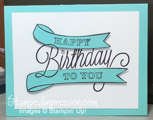
The primary design element on this card is the stamped image from Another Great Year from the Occasions catalog. It was stamped twice, once on the Whisper White card base and once on Coastal Cabana card stock. The banner shapes were cut out and attached to the card base. A Rhinestone Basic Jewel to dot the “I” and you can be done. Simple. Beautiful. Well-balanced design.
But, as I said, I wanted to make the design my own. So, after some adding and removing, here is what I made.
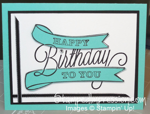
 I took the white layer and put it over some Basic Black card stock. that’s the easiest way to step up a card design.
Yet, I wanted “more.” So, I added a strip of Basic Black 1/8″ Taffeta Ribbon along the bottom and left sides. It’s not symmetrical. It’s still very simple. Beautiful. A well-balanced design.
I tried adding more layers, but they detracted from the large text. They also “took over” the design and made the words seem too crowded. At the end, this was the design I liked the best.
Top Tips:
- While I added and removed layers, I didn’t actually attach them together. I just lay them on top of each other. That minimized the amount of materials I wasted.
- Many of my cards have more than three colors. A few have only one or two. However, I find that three is the easiest number of colors to work with on a design.
- When laying the Coastal Cabana card stock over the stamped image on the Whisper White card stock, you need to align the stamped images carefully. However, they don’t need to be perfect. Mine are not on this design. To be truthful, I wanted to move them and make them more perfect. However, I also wanted to illustrate that you can overlook perfection and still have a great card!
The point of my card making is to reduce the sress in my life. Designing cards helps with that. It’s a journey I thoroughly enjoy. So, I hope this explanation of my card design process helps you enjoy a similar journey. Leave a comment and let me know how you go about designing your projects. Happy Stamping!!
